Testing UI and Conversion Rate Optimization
Website owners always ignore their websites, and user metrics. They never check their Google analytics, and almost never know how they are getting customers if any. But not all website owners think this way. Successful websites all have something in common; there is always a marketing team analyzing the website, and analyzing user metrics. These metrics show a lot of important information like:
- How many visitors you have daily?
- Where do these visits come from?
- How long do they stay on your website?
- What pages they visit, and is there any page have a lot of exits from it?
One day a client who has a very successful e-commerce website called us, and he said that a lot of people are visiting his website, and even go to the checkout page, but then they leave the page without completing the order. He monitored his website for more than a week and he noticed a big drop in the number of orders done from the website.
After having a quick look on the website, at first we didn’t find anything that may cause people to leave the checkout page. And because there are a lot of elements (UI design, Marketing targeting, Audience, Products) that play a big role in user decisions, we started with the basic questions:
- Are you targeting the right audience (i.e. the audience that will buy your products)?
- What about the website speed, is it very slow specially in the checkout page?
- Does the website throws random errors to some users that may cause this issue?
We checked all these points, and the website didn’t have any of these issues. The website was loading very fast, he was using the same ads that always work very good, and the website is working as it should without any errors.
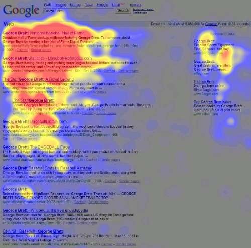
Next we moved on to use a very useful tool for A/B testing called Heat maps. Heat maps is a system that will take screenshots of your website to tell you where are your visitors clicking. It look something like that:

A heat map of Google search results page
As you can see from the above heat map, the red areas are the areas which get a lot of clicks. Heat maps help us to check the user flow in our website. where do they click? Do they see the add to card button? Do they enter their data in the checkout page or leave without entering their data?
Using heat maps in the website we discovered a lot of useful information that helped us a lot:
- Some people couldn’t see the add to card button so they use the phone to make the order
- The card page was very good on desktops, and tablets, but on mobile, users had to scroll a lot to get to the “go to checkout” button
- People who go to the checkout page always fill their data before leaving the page
- Some people click a lot of times on the phone field which means some people have some difficulties writing their phone numbers
We optimized all pages for mobile and desktop. We made the buttons a lot bigger with a very bright colors that no one can miss. We changed the card page on mobiles so that users won’t have to scroll a lot to go to the checkout. but, we never found what was the issue in the phone number field. It was working as expected from all devices we tried and people still leaving the checkout page.
Finally we knew what was wrong with the checkout page
Now the time for the next step, a video recorder program that not only show you where people are clicking on your website but also record the screen so that you can see how visitors use your website as you were with them. Finally we knew what was the issue. After watching a lot of sessions we have found that a lot of people with ipads, and iphones use the Arabic keyboard, and our client was using a plugin to validate the phone number field. In iphone, and ipad, if you are using the Arabic keyboard and switch to the numbers to enter your phone number. it will write the numbers in Arabic also not in English. The plugin wasn’t able to validate the Arabic numbers and was throwing an error to the user “PLEASE ENTER YOUR PHONE NUMBER” and sure the user wasn’t able to know what to do, so he simply exit the page.
We modified the plugin code so that it detects if the numbers are in Arabic and validate them correctly and Surprise; the conversion rate have gone up again like before and every one is happy again.
Lessons learned from this case study
- Always use analytics tools to monster your website
- Make sure your website is accessible from any device and by all people
- Make sure your website is looking good on mobile devices
- Always perform A/B testing to increase your conversion rate optimization
- Heat maps are great to get an idea about your website UI, and your visitors
- Session recording is a great tool to see your website as your users see and use it
- Conversion rate optimization requires a lot of expertise not only in web design, but in also human behavior, and online marketing
Note: This case study was a lot longer than written in this post but we tried to keep it short. This CRO project was done over a month of work to get all things right and increase the CRO again.
